RCA Rt ❯ Toolbox Scalability Real life use ⇢ 5WHYS+A3 12STEPS+CauseTree 7QT ⇢ Training
7 Quality Tools
7 Quality Tools are seven simple but powerful tools that enable people with no training in statistics to gather and work with the evidence to move from opinions to facts.
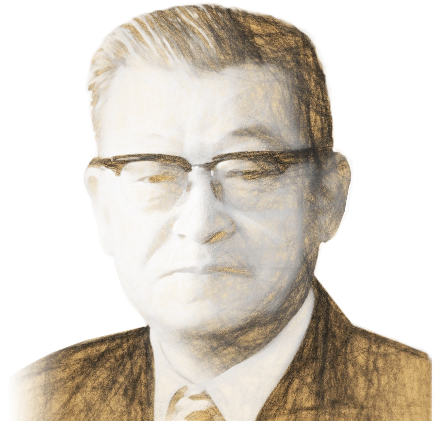
Many see these tools as the basic tools for quality improvement. Kaoru Ishikawa, a professor of engineering at Tokyo University and father of quality circles, is credited with bringing the seven concepts together as a toolkit after being inspired by W. Edwards Deming. The 7 Quality Tools are listed below with some of their applications in the RCA Rt 12STEPS to problem solving. Every issue has different characteristics and different tools will be appropriate.
Teams of people who can apply elements of these seven tools will find that their ability to solve problems is greatly enhanced.

Let us illustrate how they may be applied at appropriate times during the process of solving problems.
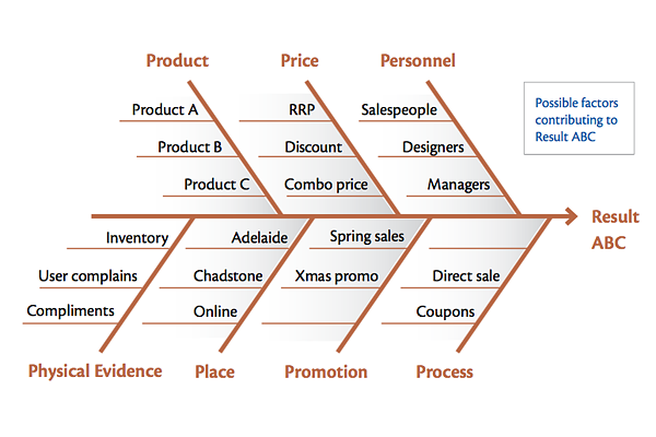
1. Ishikawa or fishbone diagram.
This tool is particularly useful in gathering ideas that may contribute to an outcome. The concept of it is simple: the problem of interest is entered at the right of the diagram at the end of the main “back bone”. The main possible causes of the problem (the effects) are drawn as bones off the main backbone. In the RCA Rt, use it particularly in:
→ Step 7, where it assists in brainstorming for causes, and
→ Step 9, where it assists in brainstorming for solutions.
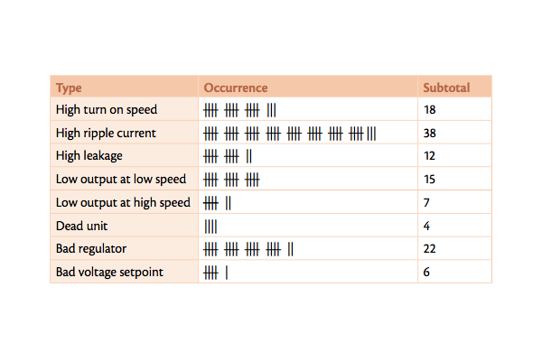
2. Check Sheet.
The check sheet is a form (document) used to collect data in real time at the location where the data is generated. Data can be quantitative or qualitative. It is a generic tool that can be used anywhere, but in RCA Rt investigation has particular relevance to::
→ Step 4, establishing a safety net by providing a temporary procedure that avoids an undesirable outcome.
→ Step 5, gathering evidence,
→ Step 6, searching for patterns and comparisons,
→ Step 7, reviewing ideas from previous investigations.
→ Step 3, reviewing ideas from previous investigations.
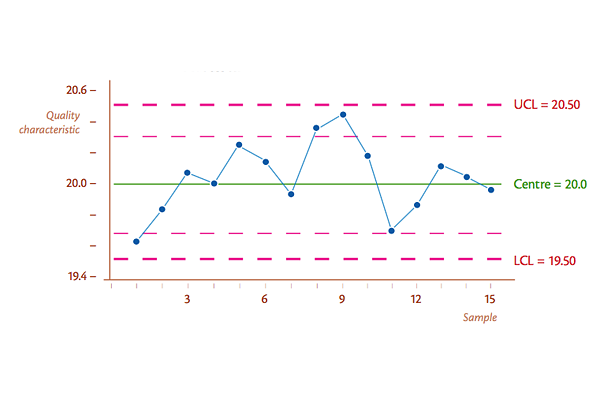
3. Control Chart.
A graph that is used to illustrate how something changes over a time period, and In statistical process control, they are used to determine if a manufacturing or business process is in a state of statistical control. If analysis of the control chart indicates that the process is currently under control (in other words stable, with variation only coming from sources common to the process), then no corrections or changes to process control parameters are needed or desired. However, if the analysis shows it's not, we should start formal problem solving.
→ Step 3, in monitoring the current state and assessing the importance of an issue,
→ Step 5, to observe and monitor the process to find out what is really happening,
→ Step 6, in searching for patterns and comparisons,
→ Step 11, in assessing whether the implemented solution actually solves the problem.
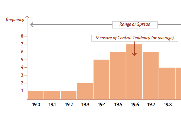
4. Histogram.
A common graph used to show how often various things happen in a set of data (sometimes called frequency distributions). The height of a rectangle (or bar) is equal to the frequency density of the interval. In the RCA Rt structured problem solving method it is very helpful in:
→ Step 3, in monitoring the current state and assessing the importance of an issue,
→ Step 5, to observe and monitor the process to find out what is really happening,
→ Step 6, in searching for patterns and comparisons,
→ Step 11, in assessing whether the implemented solution actually solves the problem.

5. Pareto chart.
A bar graph arranged to show the most important issues, clearly separating vital few from the trivial many. A Pareto chart contains both bars and a line graph, where individual values are represented in descending order by bars, and the cumulative total is represented by the line. Practically, using Pareto chart means:
(a) Break a big problem into smaller pieces,
(b) Identify the most significant factors,
(c) Show where to focus priorities,
(d) Allow better use of limited resources,
(e) Identifying the 80:20 rule in Pareto's principle, which says that 20% of causes (vital or significant few) are responsible for 80% of effects. Within RCA Rt, it is used iteratively:
→ Step 2, particularly helpful in picking the target when creating a focus on the issue to be examined.
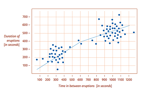
6. Scatter diagram.
A scatter diagram is a type of mathematical diagram used to display values of two variables for a set of data. The data is displayed as a collection of points, each having the value of one control variable (also called independent variable) determining the position on the horizontal axis, and the value of the other dependent variable determining the position on the vertical axis. In the RCA Rt, it is used in
→ Step 6, particularly useful when searching for patterns and comparisons.

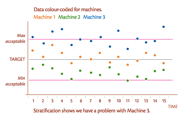
7. Stratification, Flow Chart and Run Chart.
Stratification seeks to find a hidden variable in a dataset. Particularly helpful in Step 6.
Run Charts plot the changes in a variable over time. A graph of the “number of defects per minute” is an example that would be appropriate in:
→ Step 3, to monitor the impact,
→ Step 6, when searching for patterns and comparisons,
→ Step 11, when deciding whether the improvement worked.
Flow charts are a representation of a process. The overall RCA Rt process of three stages and 12 steps may be represented as a flow chart. Flow charts are useful as a communication tool in:
→ Step 5, when discussing and issue so that all understand the issue in the same way,
→ Step 10, when detailing a process change.